
Brawl Stars’ New Logo: A 2026 Look at Supercell’s Evolution, Not Rebrand
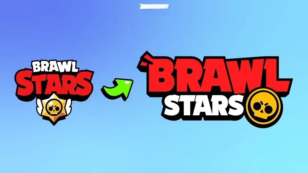
The Brawl Stars logo redesign delivers a sharper, modern identity while preserving the skull, colors, and legacy fans know.
In the fast-moving world of mobile gaming, a logo can be no small potatoes. Brawl Stars, Supercell’s pocket-sized chaos generator, gave its wordmark a facelift with the early September 2025 update, and by 2026 the refresh has settled into everyday life. The team was careful to call it an evolution, not a rebrand. Translation: they wanted a sharper, more modern look without tossing the legacy in the bin. Players noticed. Some shrugged, some grumbled, and plenty kept brawling anyway.
Why Supercell Felt the Itch
The old logo had a lot going on. According to the team, it packed in too many different elements, which made it hard to read at different sizes and in different contexts. Think ads, merch, collaborations, app-store thumbnails—the works. Competing for attention in the logo world is tough, and the old design was starting to lag. The devs also pointed out a branding quirk: Brawl is the core of the brand and the most recognizable part of the game name, but in the old logo, the first thing folks saw was Stars because of its dominant color and font size. That is a bit like a band putting the drummer on the album cover and hiding the lead singer in the back. The contrast with the app icon, where the skull does the heavy lifting, added another layer of inconsistency.
Supercell also made it clear that this was not a rebrand. The team said it did not want to make a change that would throw away the legacy the old logo represented. In other words, no pitchforks required. The goal was modernization, not a full-blown identity crisis.
A Nip Here, a Tuck There
During the design phase, the team tested several versions, ranging from minor tweaks to bold redesigns. The winning design performed best and got the most positive feedback from test groups. Some testers even assumed it was already official because it lined up so neatly with the app icon. Before launch, the team made small adjustments while keeping the core identity intact: the skull element, colors, and font style stayed fairly similar. That is the sweet spot—different enough to feel fresh, familiar enough that longtime players do not need a map to recognize it.
| Element | What changed | What stayed |
|---|---|---|
| Wordmark | Cleaner and more modern, with better readability at small sizes | Brawl remains the star of the show |
| Skull | Refined for the new look | Still a core identifier |
| Colors and font | Tuned for consistency | Familiar palette and style |
The 2026 Verdict
By 2026, the logo debate has cooled. The refreshed mark is out in the wild, and the sky has not fallen. The team said related logos such as Championship and Brawl Talk would follow later, and that wider rollout has become part of the background noise. Fan reaction at reveal was mixed; plenty of players had a soft spot for the old badge, and some still do. That is normal. Nostalgia is undefeated. But the practical case for the update was solid: a simpler mark reads better at small sizes, travels across merch and ads, and gives Brawl more of the spotlight.
The proof is in the pudding. A logo does not make or break a game, but it does shape first impressions. Brawl Stars is still the same loud, quick, chaotic ride; the new wordmark just wears a cleaner jacket. In 2026, the takeaway is simple: this was not a rebrand, not a legacy bonfire, and not a reason to sharpen pitchforks. It was a refresh—one that Supercell hopes will age better than the old one did. Whether fans love it or merely tolerate it, the brawl goes on. 🥊